misc.
Beyond my coordinating roles, I've always kept a hands-on relationship with design itself. Over the years, that's meant working across a wide range of graphic projects for different clients and people, from developing minimalist logo’s to designing bold, narrative-driven posters. That range has been essential in sharpening how I adapt a visual language to whatever medium or brand it needs to serve.
What follows is a selection of the projects I've enjoyed making most, each one different, but all built around the same focus: clarity, impact, and a sense of balance in the final image.
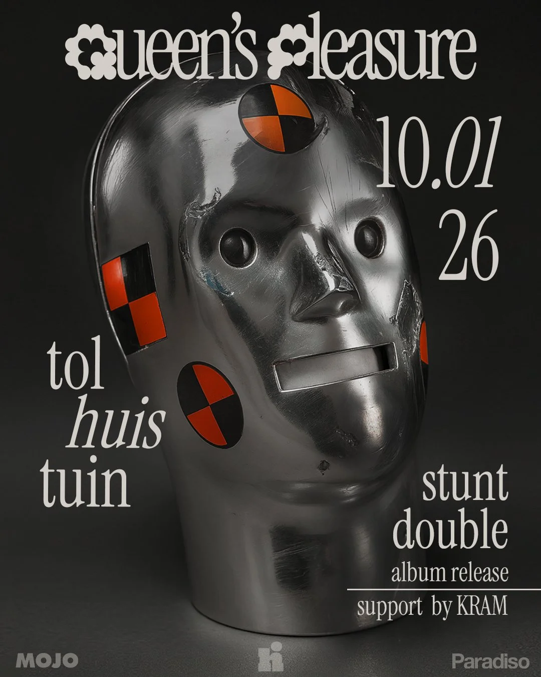
Queen's Pleasure Poster
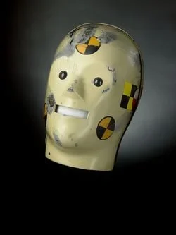
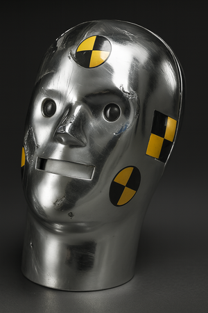
For the Stunt Double EP release by Queen's Pleasure, I turned a piece of historical research into a visual campaign built around a single idea: the stunt double. That led me to Vince and Larry, the original Smithsonian crash test dummies, and I found myself drawn to the distorted, human-like quality of their heads as a way to reflect the EP's raw energy.
The band wanted chrome and holographic textures, which meant a slightly unconventional approach. I used AI to generate a raw 3D base of the dummy head, then sculpted the final look by hand in Photoshop, building custom metallic textures and lighting until it matched the EP's aesthetic. What came out the other side sits somewhere between vintage safety-test imagery and modern digital craft.
Fermento
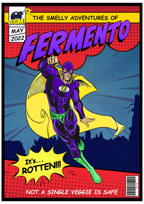
What started as an inside joke evolved into a custom retro superhero poster celebrating the art of fermentation. I made it as a birthday gift for a chef friend, built entirely around his slightly over-the-top passion for fermenting everything he could get his hands on. His nickname, Fermento, made the idea obvious almost immediately: a classic comic book protagonist, rendered in bold typography and a saturated palette that leans fully into the golden age of comics.
It's a small project, but one where professional design and a personal, lighthearted story got to sit in the same frame.
Rubincarter Logopack
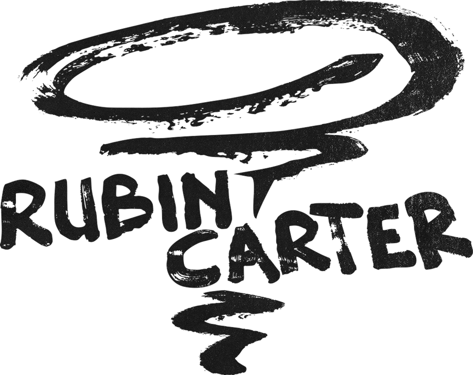
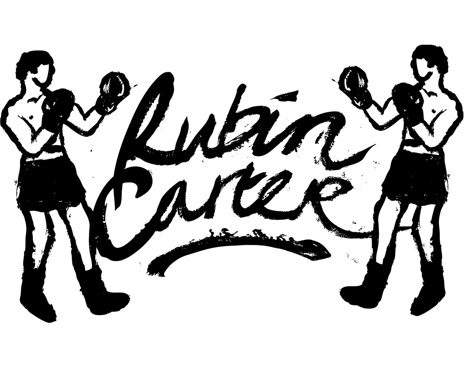
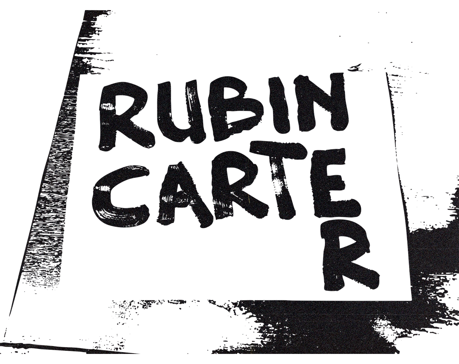
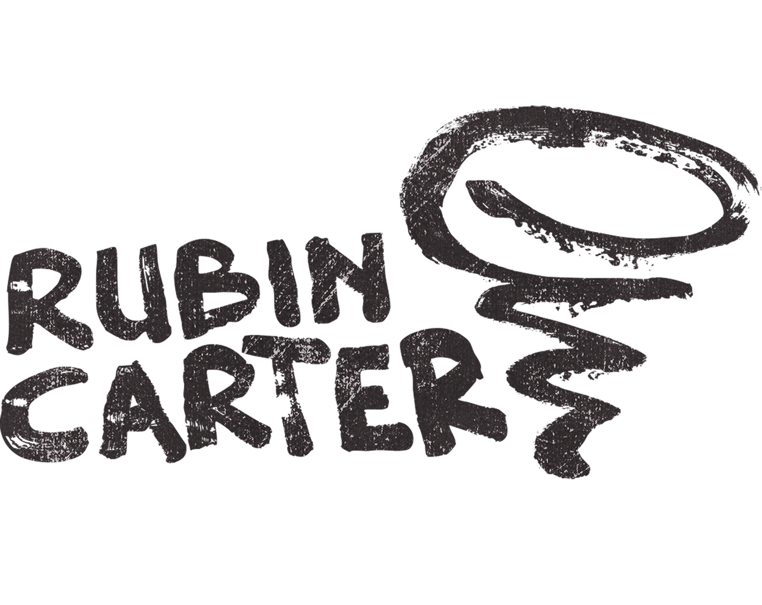
For the debut of Amsterdam-based project Rubincarter, I developed a visual identity that bridges 1960s analog craft with modern stage presence. Their sound draws on the storytelling of Bob Dylan and Leonard Cohen, poetic narratives carried by something rawer underneath, and I wanted the identity to feel the same way. I stepped away from the screen and worked with the materials of the era instead, hand-rendering the logo with latex paint and a coarse brush so the mark itself would feel as unpolished and authentic as the music.
The name carries a double meaning, a nod to boxer Rubin "Hurricane" Carter, immortalized in Dylan's song of the same name, and I let that shape the direction: boxing and storm motifs worked through thick, rugged strokes into a visual suite that could stretch across different uses. For their live shows, I also built a subtly animated version of the logo to run as a dynamic backdrop behind them on stage.