BEYOND MY COORDINATING ROLES, I HAVE ALWAYS MAINTAINED A HANDS-ON APPROACH TO DESIGN, CRAFTING A DIVERSE RANGE OF VISUAL SOLUTIONS.
Throughout my career, I’ve navigated a broad spectrum of creative challenges. From developing minimalist logo marks to designing bold, narrative-driven posters. This variety has been essential in sharpening my ability to adapt my visual language to any medium or brand identity.
Whether I’m building a brand from the ground up or capturing the energy of an event on a single page, my focus remains on clarity, impact, and aesthetic balance. The following is a curated selection of my favorite projects, reflecting my passion for versatile design and my commitment to high-quality craftsmanship.
KEY PROJECTS*
KEY PROJECTS*
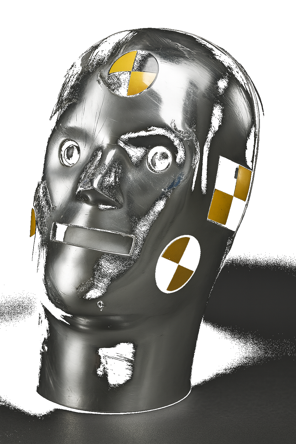
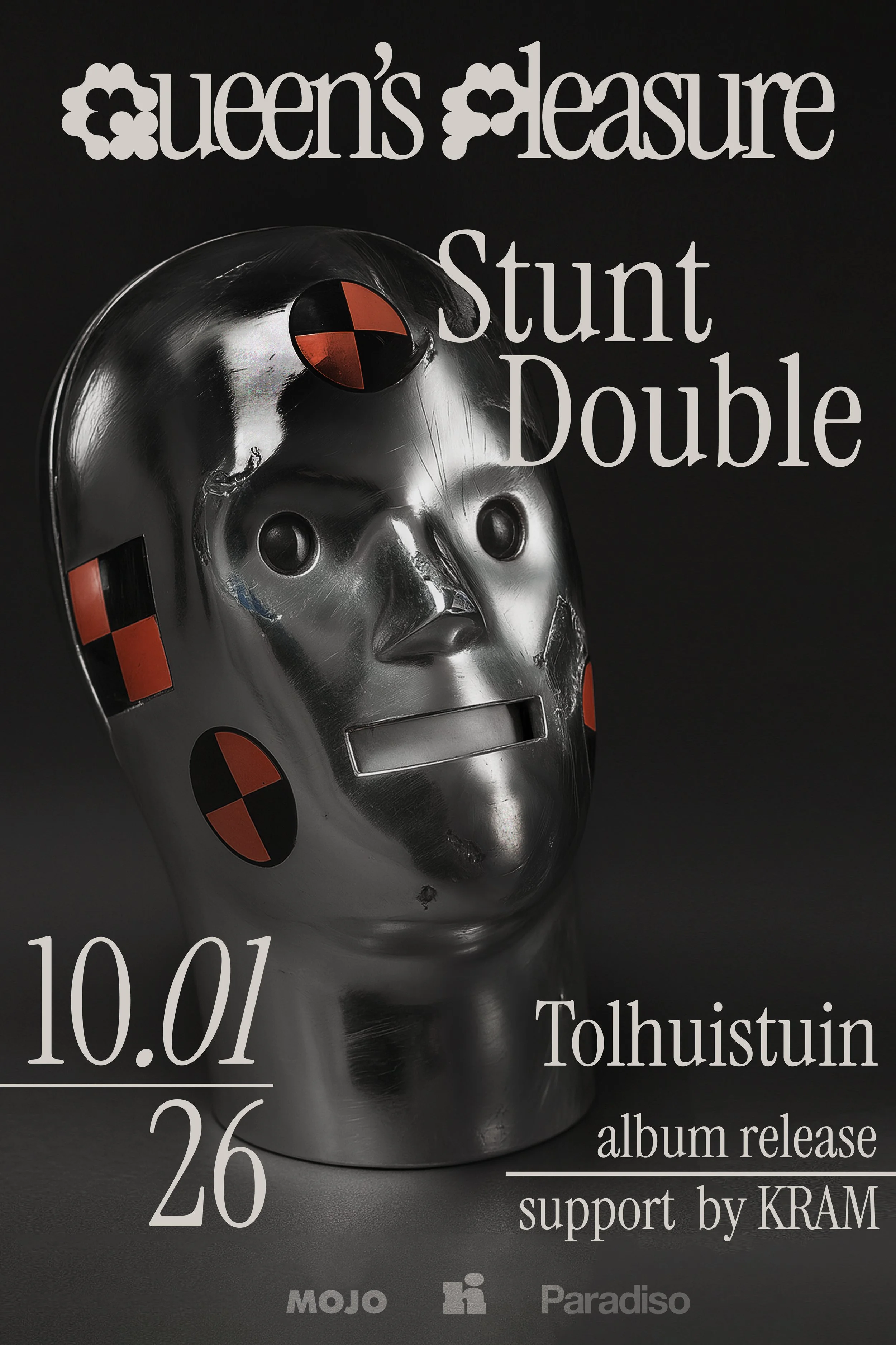
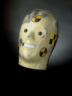
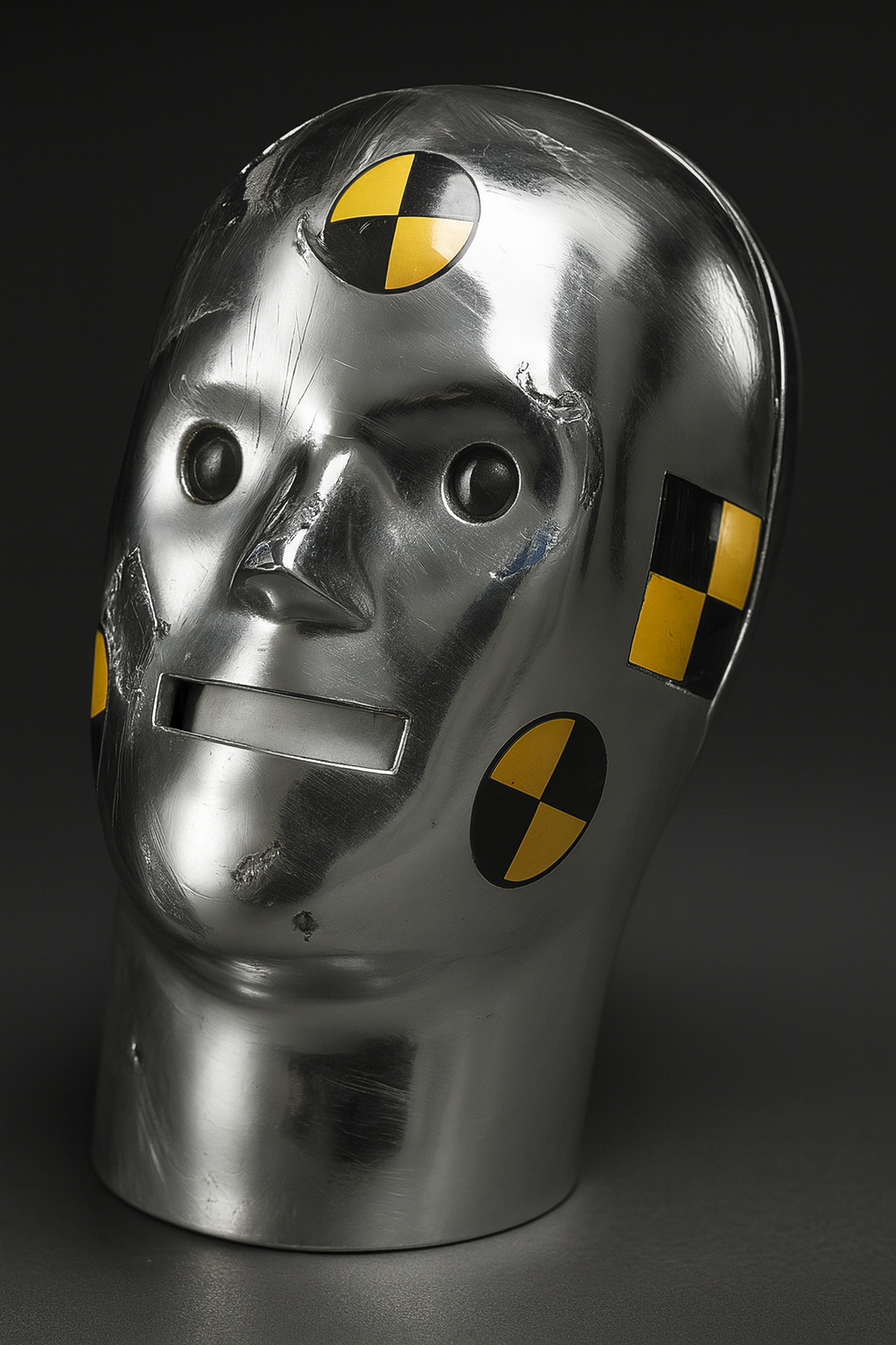
QUEEN’S PLEASURE POSTER
FOR THE 'STUNT DOUBLE' EP RELEASE BY QUEEN’S PLEASURE, I TRANSFORMED HISTORICAL RESEARCH INTO A CUTTING-EDGE VISUAL CAMPAIGN.
Inspired by the concept of the "stunt double," I explored the history of Vince and Larry- the original Smithsonian crash test dummies. I wanted to reinterpret their story, focusing on the distorted, human-like quality of the dummy heads to reflect the raw energy of the EP.
To meet the band’s request for chrome and holographic textures, I took a resourceful approach to 3D design. Using AI to generate a raw 3D base of the dummy head, I manually sculpted the final look in Photoshop, applying custom metallic textures and lighting to align with the EP's aesthetic. The result is a fusion of vintage safety-test imagery and modern digital craft.
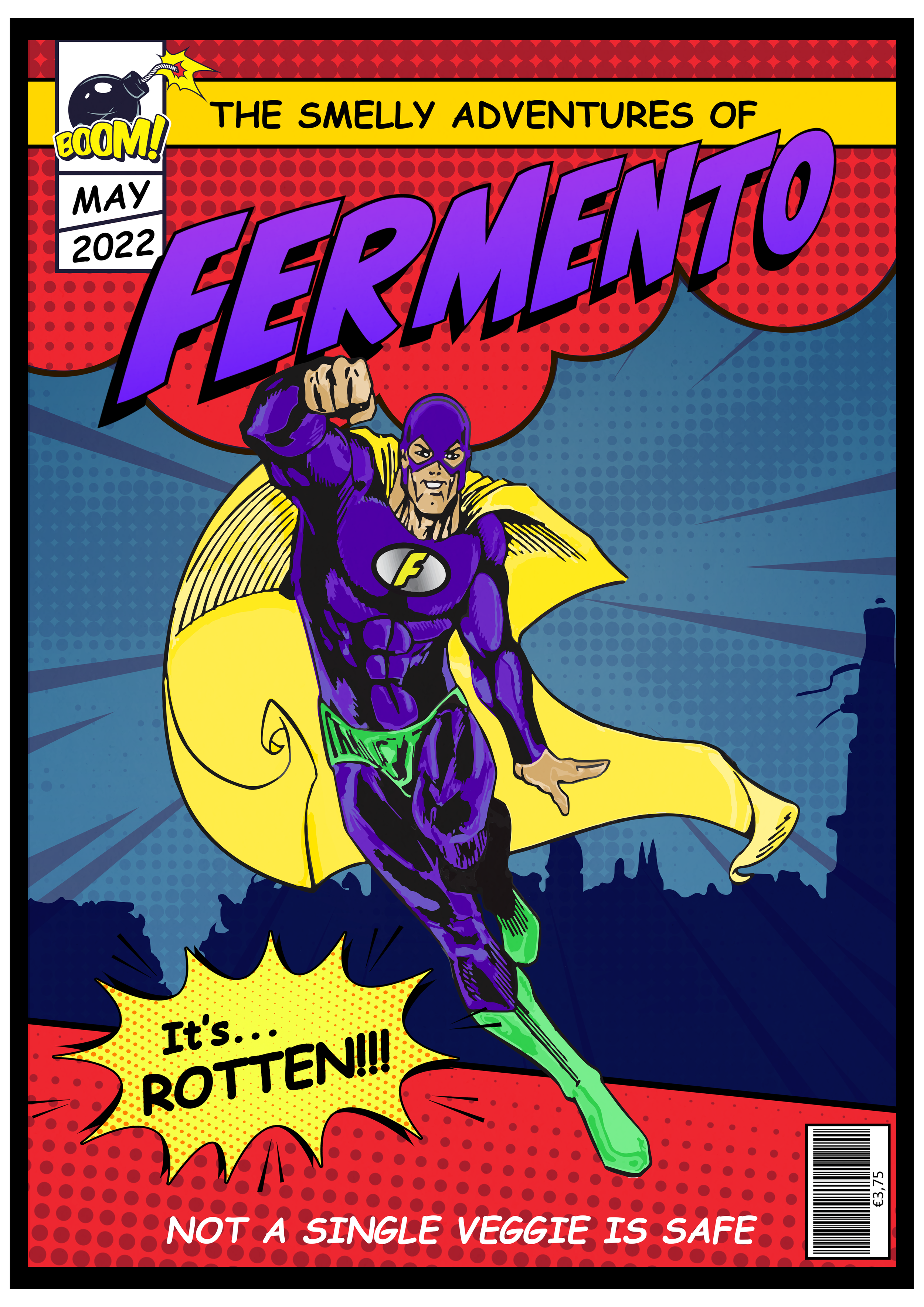
FERMENTO
WHAT STARTED AS AN INSIDE JOKE EVOLVED INTO A CUSTOM RETRO SUPERHERO POSTER CELEBRATING THE ART OF FERMENTATION.
Designed as a birthday gift for a chef friend, this project centers on his "over-the-top" passion for fermenting products. His nickname, Fermento, immediately sparked the idea of a classic comic book protagonist. I leaned into the vintage superhero aesthetic, using bold typography and a saturated color palette to bring this culinary hero to life.
By blending professional graphic design with a personal narrative, I created a high-energy visual that pays homage to the golden age of comics while capturing a unique, lighthearted story.
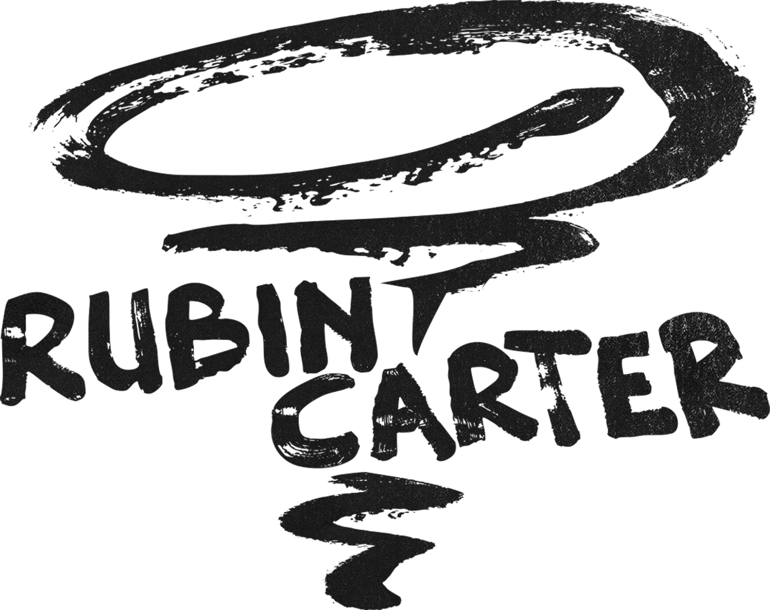
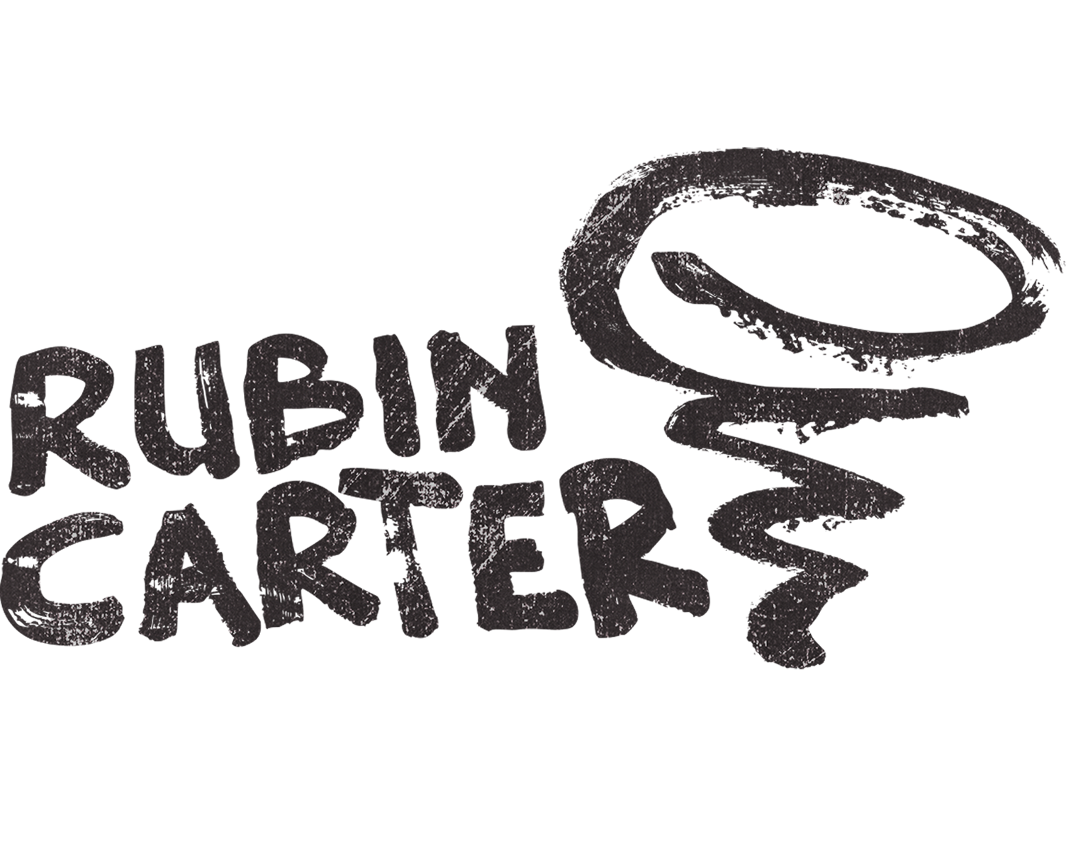
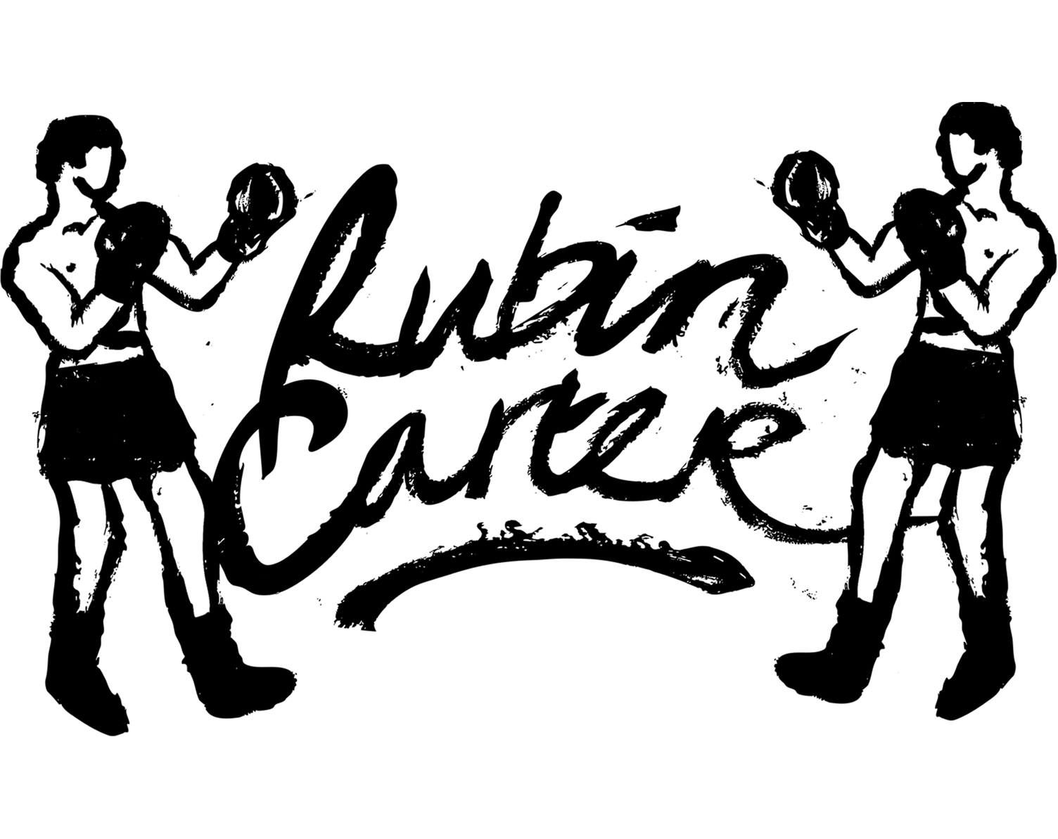
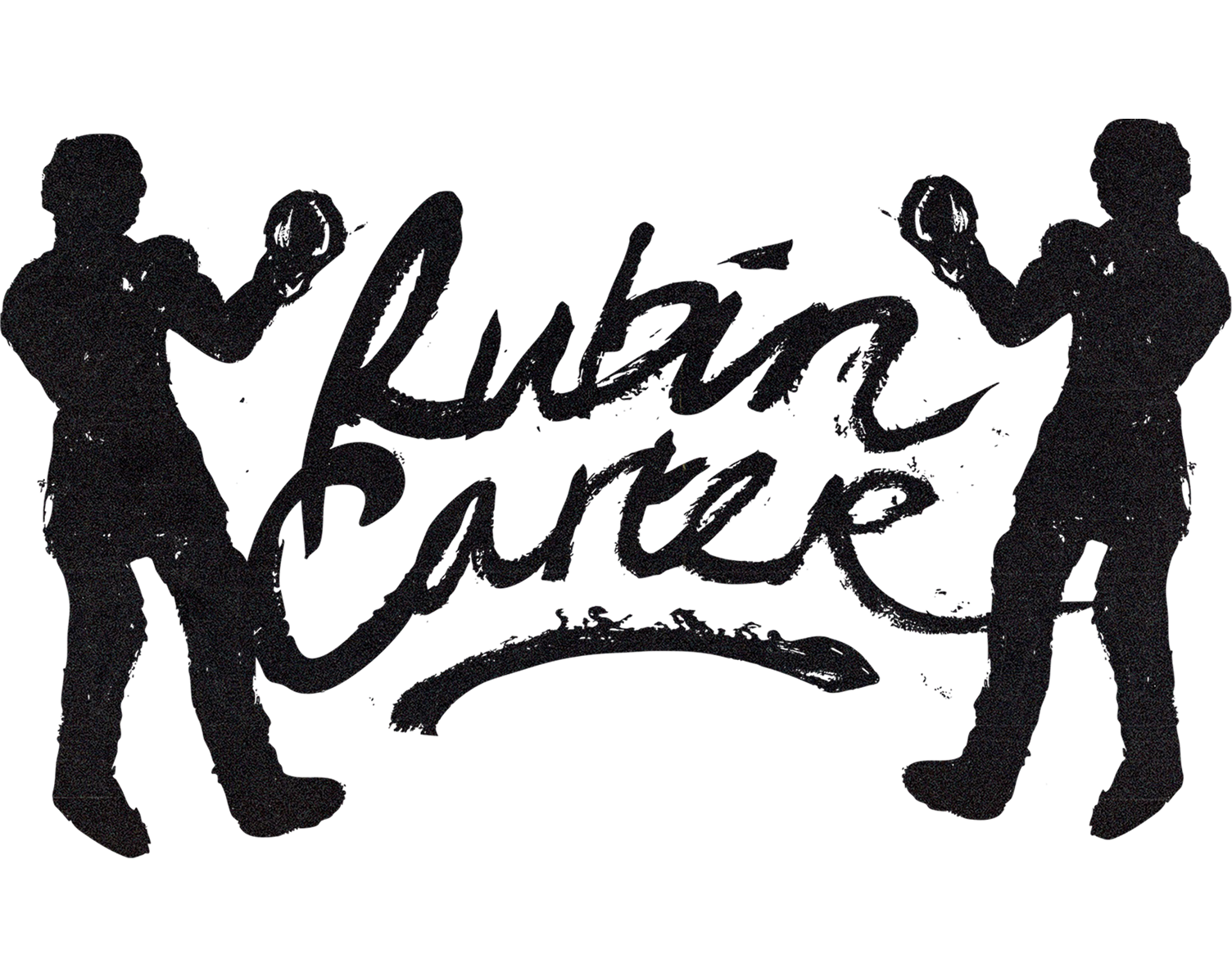
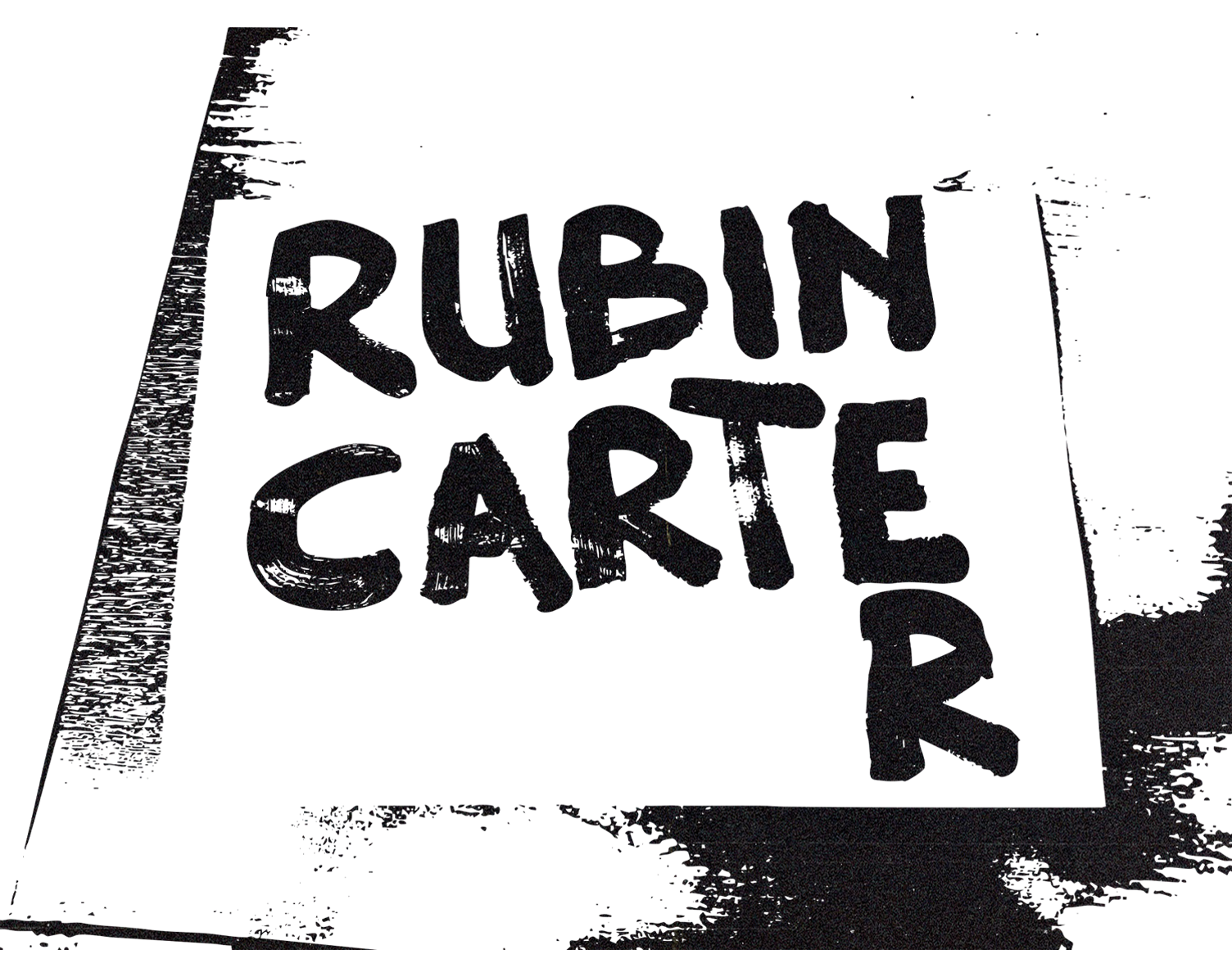
Rubincarter logopack
FOR THE DEBUT OF AMSTERDAM-BASED PROJECT RUBINCARTER, I DEVELOPED A VISUAL IDENTITY THAT BRIDGES 1960S ANALOG CRAFT WITH MODERN STAGE PRESENCE.
Inspired by the storytelling of Bob Dylan and Leonard Cohen, RubinCarter’s sound combines poetic narratives with gritty, raw energy. To capture this, I stepped away from the screen and looked at the materials of the 60s, using latex paint and a coarse brush to hand-render the logo. This tactile approach ensures the visual identity feels as authentic and unpolished as the music itself.
The concept explores a double meaning: the boxer Rubin "Hurricane" Carter, famously immortalized in song by Dylan. I experimented with both boxing and storm motifs combined with rugged thick paint strokes, resulting in a versatile visual suite. To elevate the live experience, I created a subtly animated version of the logo to serve as a dynamic backdrop during their shows.